Rebranding Avalon Waterways for 2022
Avalon Waterways has redefined cruising by going against the current and away from the ordinary. Delivering unparalleled experiences and boundless exploration, Avalon puts you in the captain’s seat to navigate your journey, fuel your passions and steer clear of the unexpected as you cruise down the world’s most memorable and mesmerizing waterways. One step aboard our modern, luxurious Suite Ships with the grandest views in cruising and you’ll see how the tides are changing.
Old Avalon
The Old Avalon Look was focused on Joyful Optimism, Included bold colors, script fonts, and overly saturated photography.
My challenge was to convert Avalon to a more luxury brand, drawing on inspiration from luxury hotels and fashion.
Click the button to jump to my execution of the new look and feel.
or read below for more information on my design process.
Brand Personality
-

Photography
Photography that shows richness in color,
movement and personality.
-

Copy
Clever and emotional with Elevated tone.
Content with a Purpose
-

Style
Elegant,
upscale design.
Focusing on Black and White
For the new look I created, the main colors used are Black and White. Secondary colors are Light Gray, Silver and Dark Gray
(for body copy text) and tertiary color to be used sparingly as an accent is Gold. With this new palette it allows for a blank canvas to to bring the brand to life with photography.
Colors
Making it stand out.
• Textures and details
• Unique and different angles
• Various viewpoints and perspectives
• Lighting is key
(golden hour, nighttime)
• Using diverse set of models
• Photography in motion
• Using both color and black & white
• Personality comes through in photography
Richness and pops of color come from photos.
Previous brand blue shades come through via the beautiful skies, exterior of our ships, on the rivers of Europe, even clothing on the Models.
Typography & Spacing
Breathability
The typography focuses on whitespace, spacing and breathability.
Fonts are set in Graphie and Kepler-Std. Headings & Subheads are in all caps.
Headings should have a 1-2 pixels of letter spacing in code or the tracking set to about 50. When 2 lines are in a Headline, line 2 will be 50% of line 1.
Suheads should be 2-3 points larger than body copy.
Body copy is in sentence case and should have tracking set to about 80 and 1 pixel of letter spacing in code.
Design Elements
Buttons
Height and padding left & right of buttons are 50 px.
Text Links
Extra space before text links are
used as a separator.
Dividers
Dividers are approx .5 px
and approx 100 px wide.
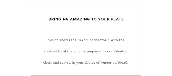
Accent Box
This Gold Accent can be used to add a pop of color or emphasis.
Should be approx .5px.
Photo Collages
Collages can be off grid, overlap or be evenly spaced.
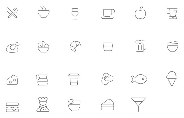
Icons
Light Icons
Icons are using the Fa-Thin class from Font Awesome. These can be downloaded as vectors from Font Awesome or added as a class in HTML. Colors are silver or white.
Dark Icons
Icons are also using the Fa-Thin class from Font Awesome.
These are reversed out for use on a dark background.
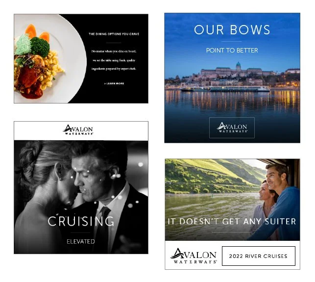
Brand Execution
Now that you know what makes up this new look!
Click below to view work examples.


